
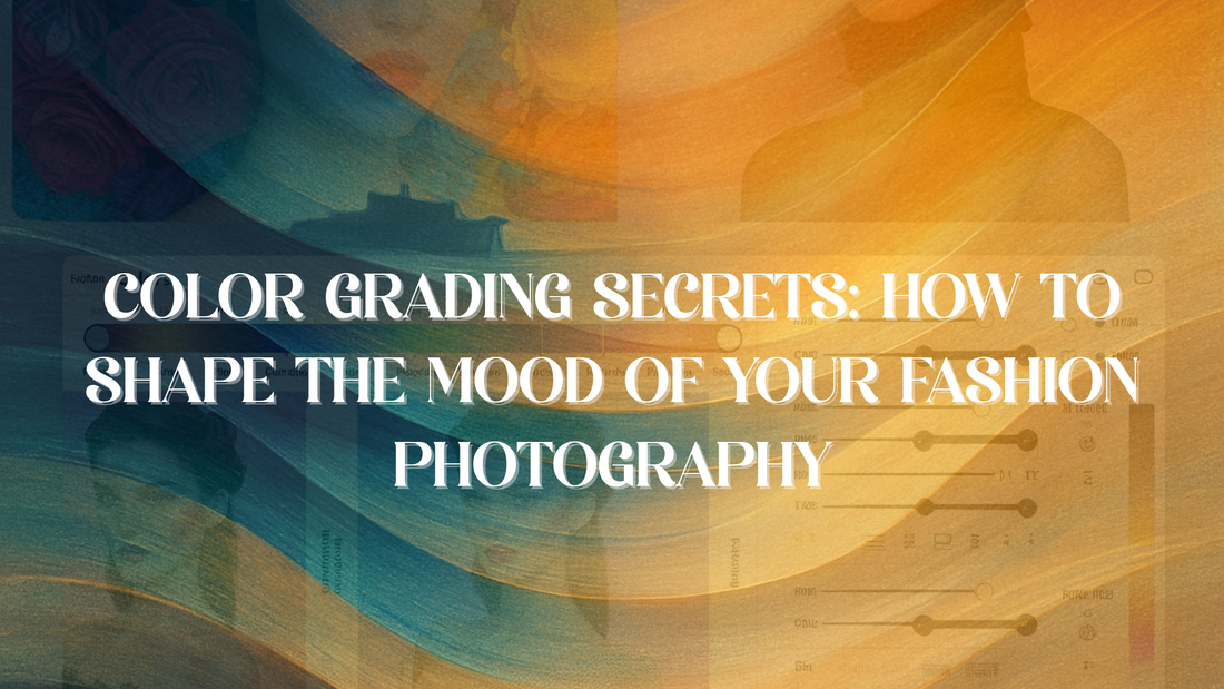
Color Grading Secrets: How to Shape the Mood of Your Fashion Photography
Share
Color isn’t just decoration. It’s a language that tells your story before anyone reads your caption. In fashion photography—especially for grand settings like a fashion cruise or fashion week at sea—your color grading choices shape the entire mood and message of your work.
At BLVCK EXODUS, we know this craft is more than visuals. It’s, art, branding, and raw creative expression all at once. That’s why our upcoming event, Fashion Forward at Sea (April 23–28, 2026), is designed to help you sharpen your eye, build your brand, and connect with fellow artists—without losing your authenticity or your faith.
But first: let’s talk real technique.
---
Why Color Grading Matters in Fashion Photography
Color grading is what turns a snapshot into a narrative. It’s the difference between a disposable feed post and an image that stops people mid-scroll.
Whether you’re prepping for fashion shows 2026, launching your next campaign, or documenting the Bermuda content challenge on our luxury fashion cruise, these color grading secrets will help you create work with intention.
---
📸 Color Grading Secrets for Fashion Creatives
---
🎨 1️⃣ Define Your Mood from the Start
Before you even shoot:
Ask: What feeling should this image create?
Examples:
Luxury and warmth (ideal for cruise fashion show branding)
Edgy and bold (for runway show at sea)
Soft and reflective (perfect for prayer circles or branding workshops for designers)
✅ Tip: Make mood boards to keep yourself consistent across the whole shoot or collection.
---
🖌️ 2️⃣ Learn Basic Color Psychology
Color speaks without words. Use it intentionally.
Warm Tones (reds, oranges): Passion, excitement, social energy
Cool Tones (blues, teals): Calm, sophistication, trust
Earthy Neutrals: Editorial class, timeless style
High-Contrast Black & White: Urban, gritty, raw truth
If you’re shooting at a creative fashion retreat or on a luxury fashion cruise, consider the location’s colors—tropical greens, turquoise oceans, golden sunsets.
---
💡 3️⃣ Get Your Base Right
Nail your exposure and white balance first.
Poorly shot images can’t be rescued by color grading alone.
For cruise shoots, be mindful of strong sun, reflections, and variable ship lighting.
✅ Pro Tip: Use a grey card for consistent color balance on ship interiors.
---
🌅 4️⃣ Craft a Signature Look
Your style is your brand. Make it recognizable.
Do you prefer film-inspired muted tones?
High-contrast editorial polish?
Vibrant, streetwise color?
For fashion week at sea or the Bermuda content challenge, consider:
Emphasizing sunset warmth for romance and luxury
Cool oceanic blues for relaxed, serene vibes
High contrast for runway drama
---
📑 5️⃣ Tell a Story with Color
Think of grading as your silent script.
Desaturated, cool looks: Introspective, serious (great for creative panels or reflective portraits)
Vibrant colors: Energetic, social, fun (perfect for networking for fashion creatives)
Soft fades: Gentle, faith-friendly, personal storytelling
Your audience includes everyone from MUAs and photographers to designers and influencers. Your color should unify your vision while respecting the diversity of your viewers.
---
📷 6️⃣ Practical Fashion Photography Tips for Color Grading at Sea
Shooting aboard a luxury fashion cruise comes with unique challenges and advantages:
Bright ocean glare? Use polarizers to control reflections.
Golden hour at sea? Lean into rich, warm hues.
Indoor ship lighting? Correct mixed sources for consistency.
Tropical Bermuda backdrops? Enhance local color to make images pop.
✅ Batch process your edits to keep a cohesive look for styling competition entries or branding workshops.
---
👗 Why These Skills Matter for Your Creative Career
If you're serious about fashion shows 2026 or building a portfolio that gets booked, mastering color grading isn’t optional.
It shows your vision.
It creates brand consistency.
It demonstrates your understanding of storytelling, mood, and audience.
At Fashion Forward at Sea, you'll get a chance to test and refine these skills in real time—while surrounded by other passionate creatives.
---
⚓️ What Awaits on Fashion Forward at Sea
This isn’t your average conference or photoshoot location. This is a luxury fashion cruise designed for creative breakthroughs:
Runway show on the cruise – Capture editorial-level movement and lighting.
Styling competition – Show your signature color style.
Bermuda content challenge – Tell authentic, location-inspired stories.
Optional prayer circles – Reflect, refresh, and center your creative practice.
Creative panels, networking events, branding workshops – Expand your skills and your network.
---
📅 Details You Need to Know
Dates: April 23–28, 2026
Ship: Royal Caribbean’s Independence of the Seas (Cape Liberty, NJ to Bermuda)
Pricing: Starts at $1,085 per person
Deposit: $250 per person secures your spot
This is one of the top events for fashion lovers looking for growth, connection, and artistic challenge in 2026.
---
✨ Ready to Elevate Your Vision?
If you’re ready to master color grading for photographers, level up your storytelling, and connect with a creative community that welcomes all—while staying true to your faith and purpose—this is your invitation.
✅ Book now at blvckexodus.com
✅ Or text CRUISE to 973-662-4787 to secure your spot.